Project Ken
Advertising, Poster Design, Creative Direction
During my senior thesis project, I wanted to challenge myself and design for multiple famous fast food chains. I wanted to test myself and see if I could encapsulate several design styles within one project. As I was 2-3 weeks into the project, I realized something wasn't working. I needed a bigger picture, I needed to make a difference with these designs. I shifted the project on a 180 and I created it to go against the brands, not in favor of them. This took a lot of time and my professor and I were hesitant about a huge change.
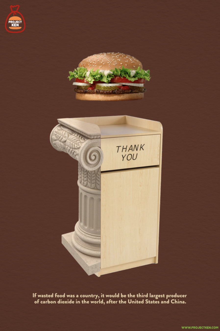
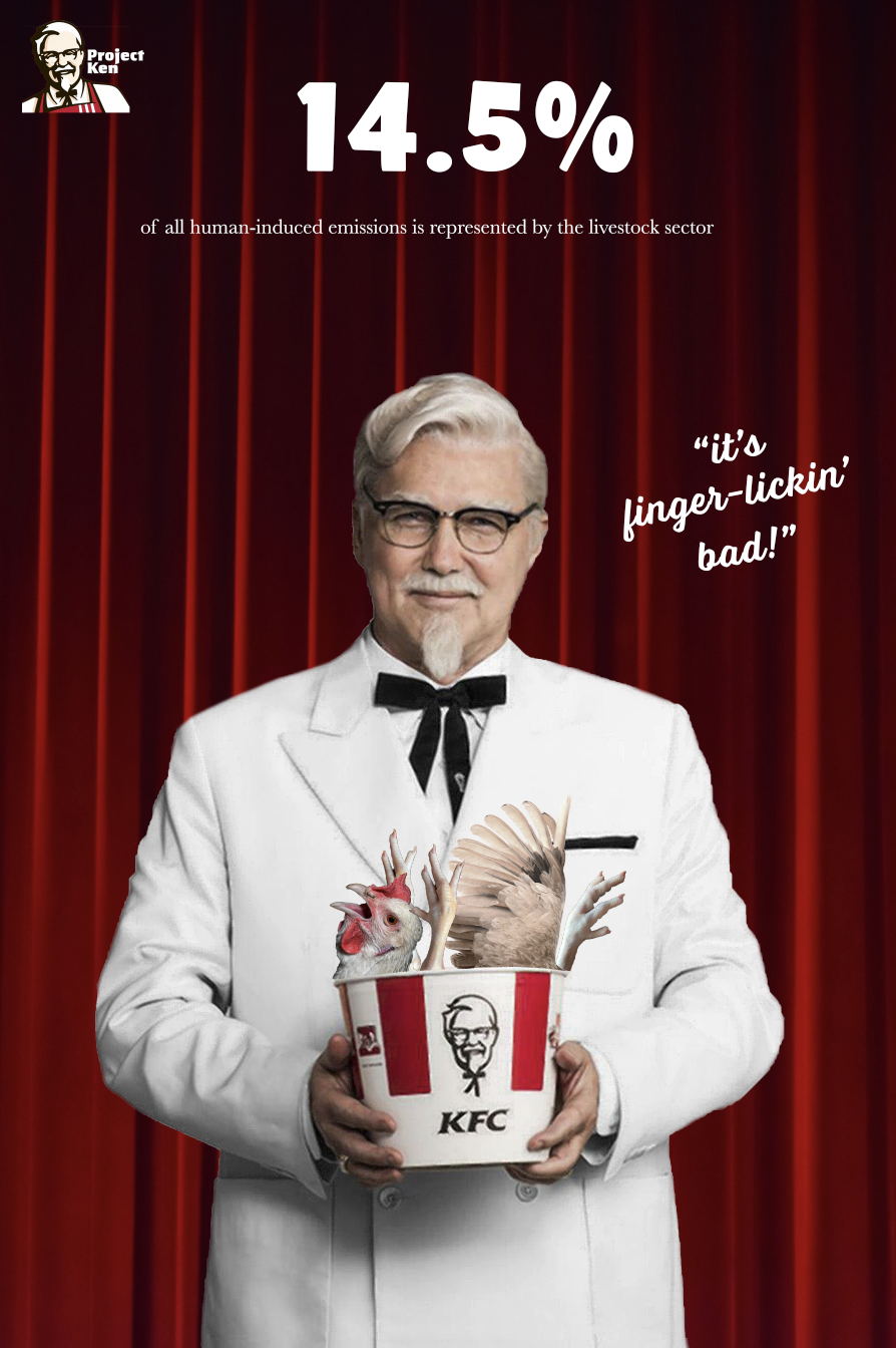
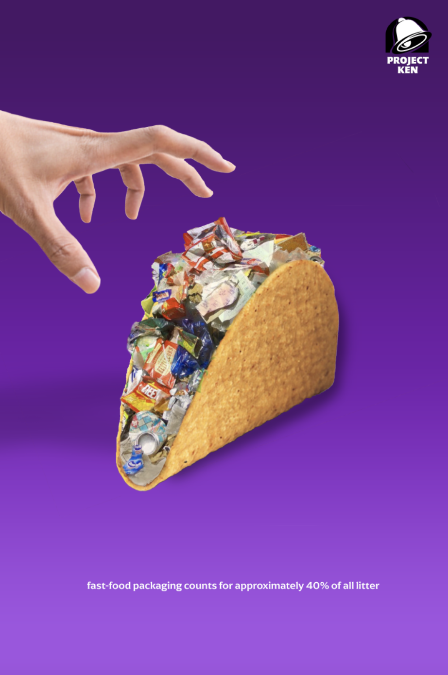
I decided to create Project Ken, an organization spreading awareness about harmful environmental practices carried out by some of our favorite brands (ken meaning “one’s range of knowledge or sight”). I focused on fast food restaurants and I created different advertisements for 6 very different brands that caught the audience's attention and served them facts instead of food. This guerilla advertising campaign acts ad real advertisements for these companies, however when you take a closer look and search for the new upcoming menu item, you will find the statistics that reveal the truth behind these global warming monsters!
Art Direction: Professor Abby Guido
These posters would be put into public spaces for the audience to observe and to make them think about the impact of their favorite fast food spots. Take a close look at the unique logo manipulations I made for each brand; they may look like the real logo but they apply concepts that are concerning.
The statistics used in each poster match the visuals, as well as the new logo.
My Design Process
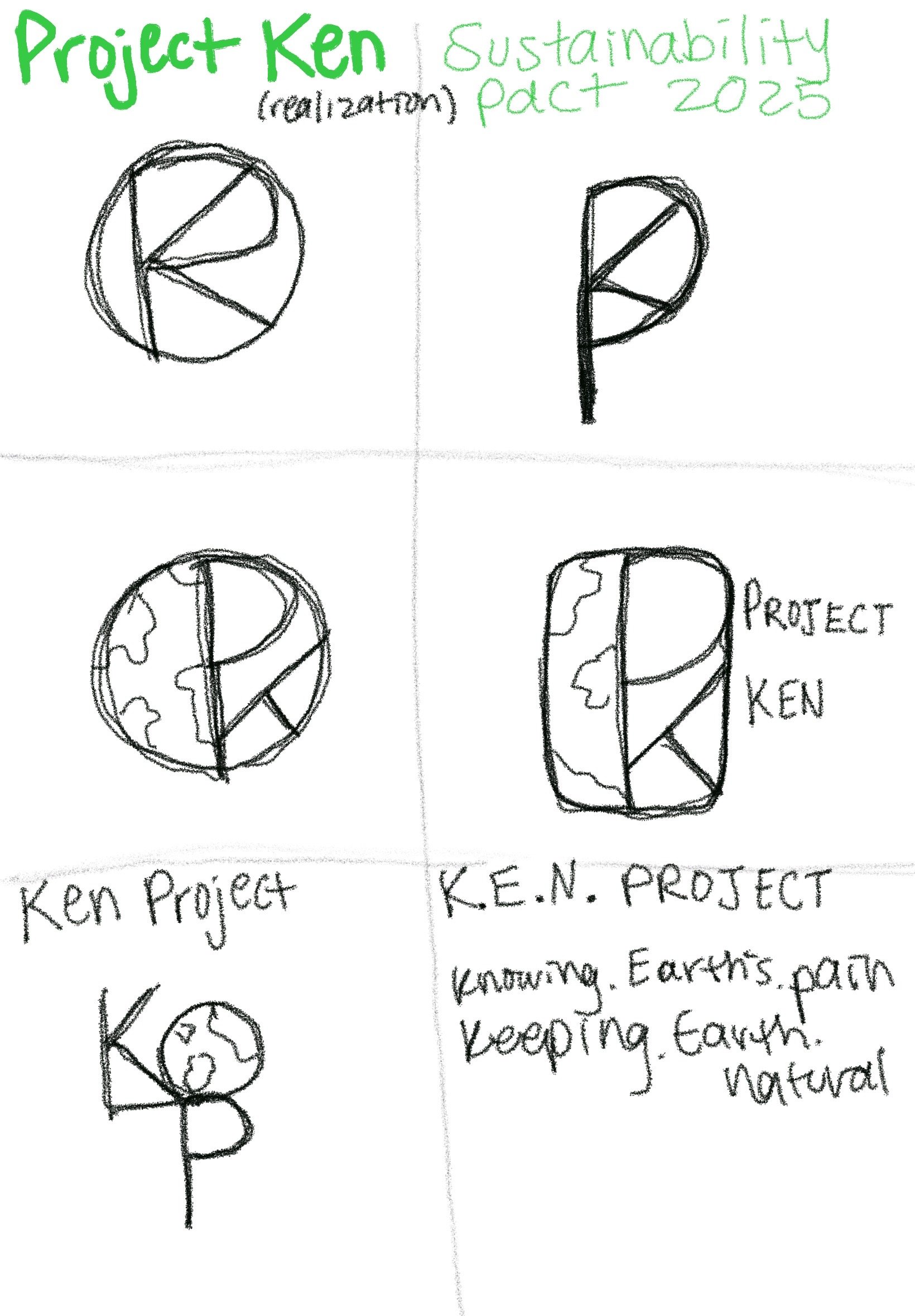
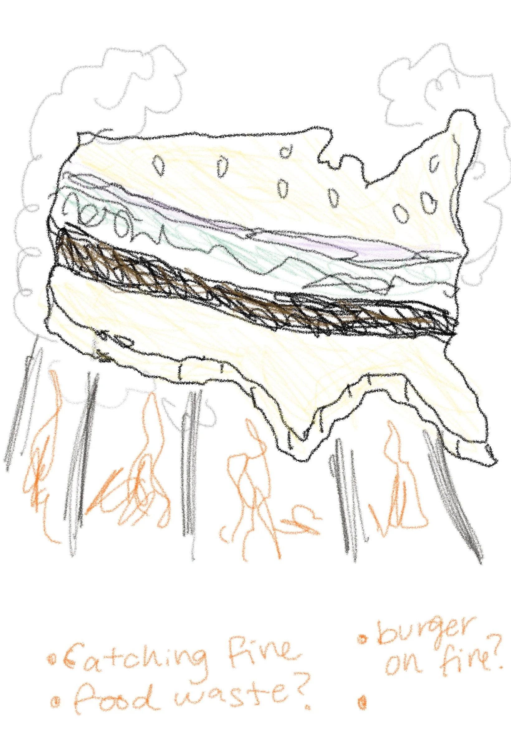
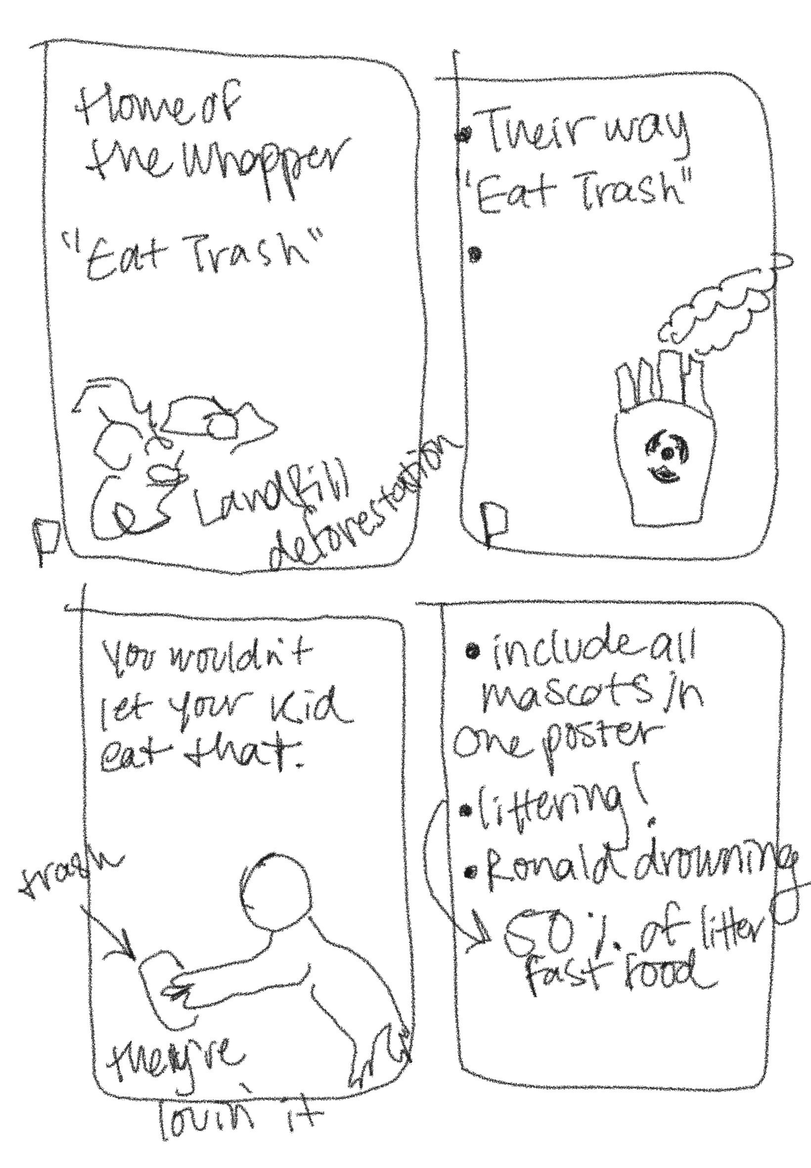
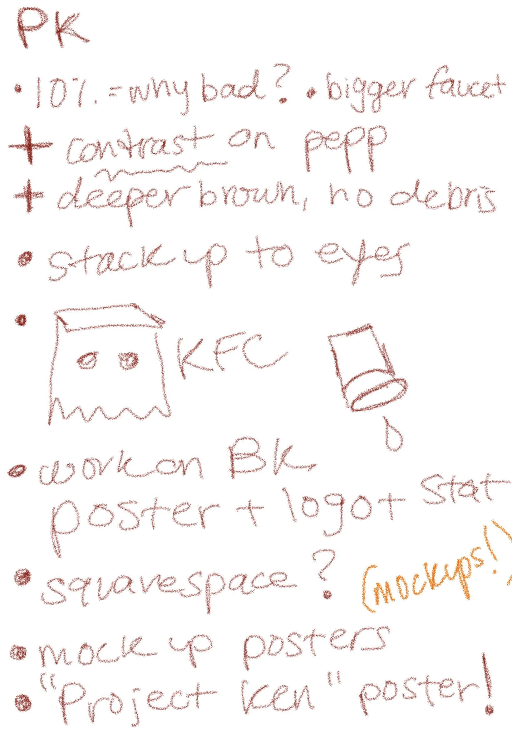
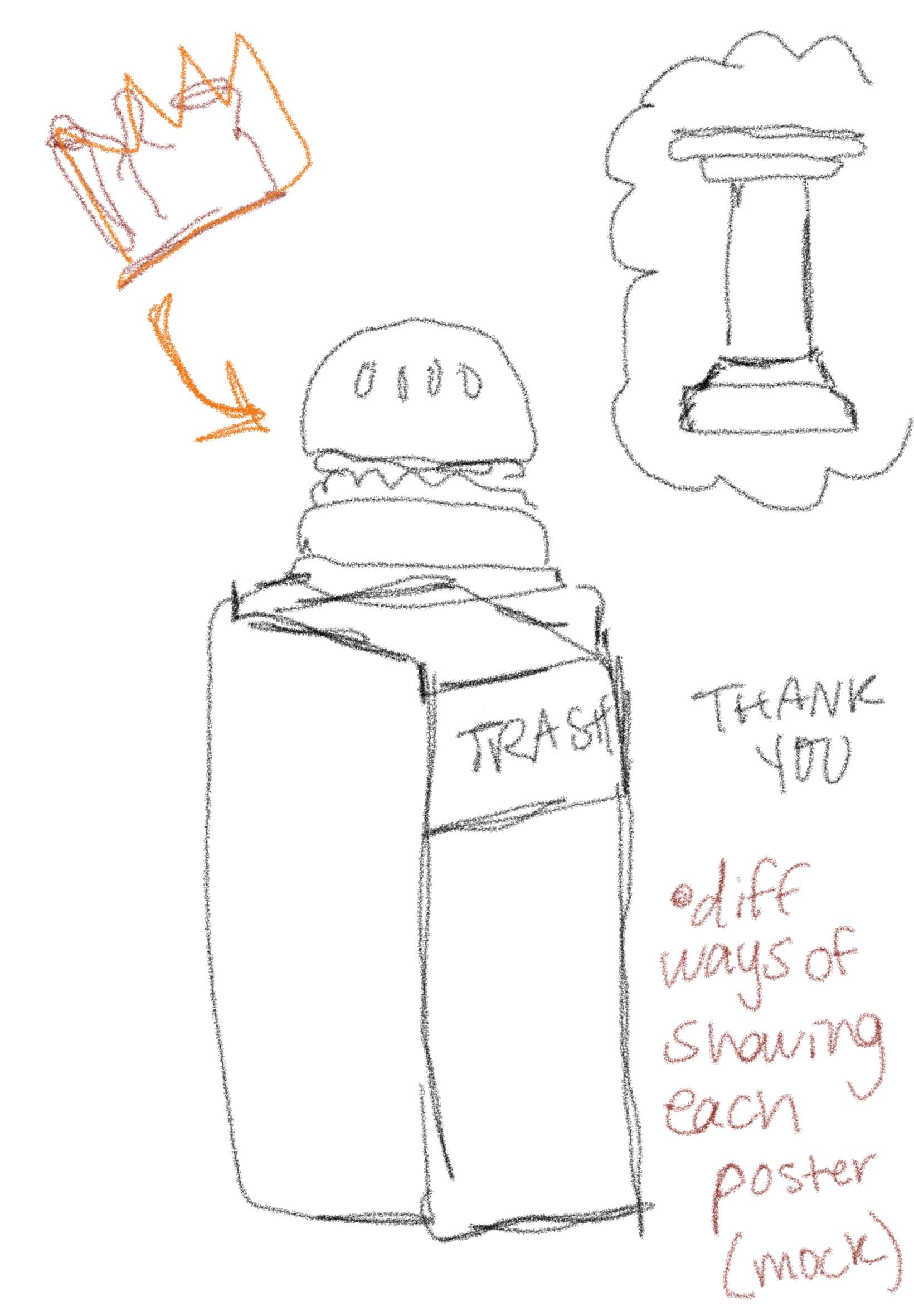
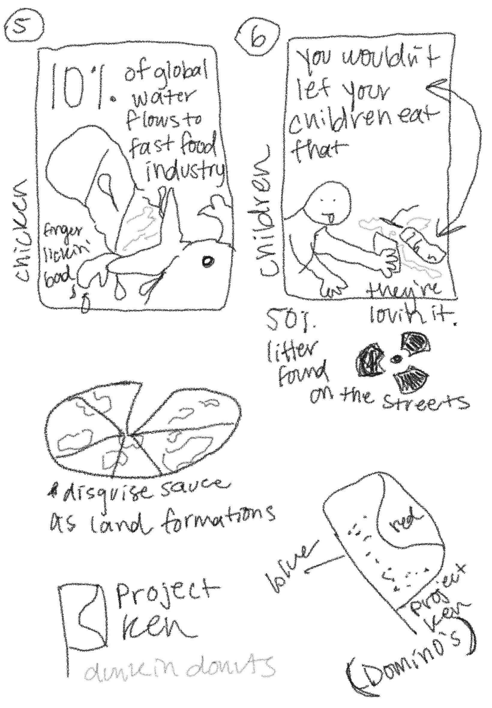
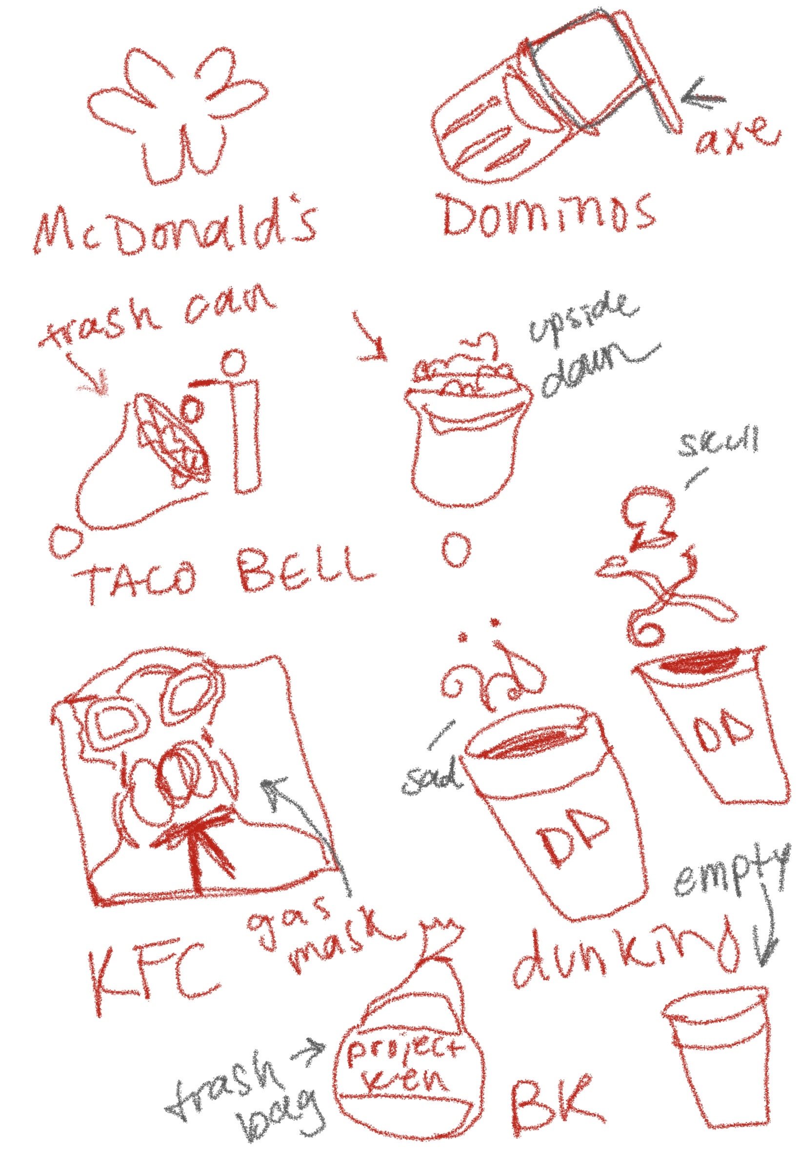
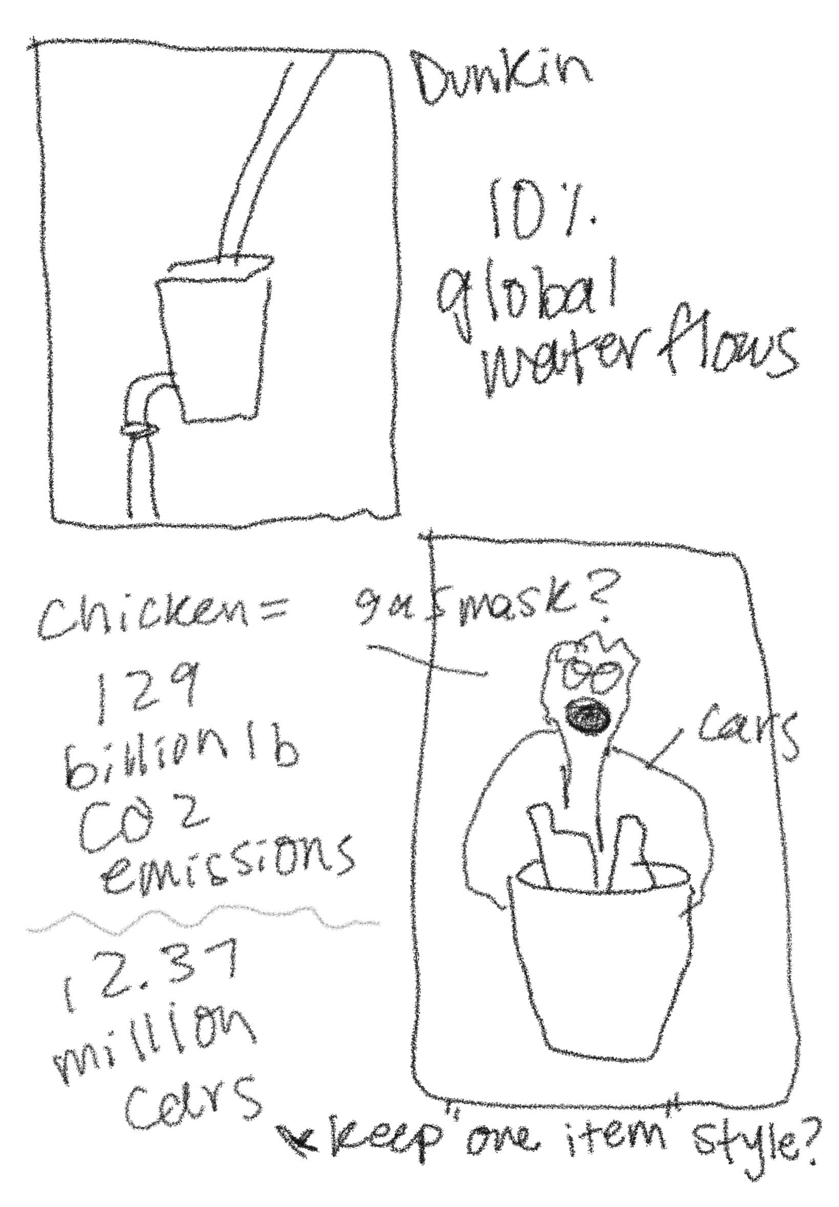
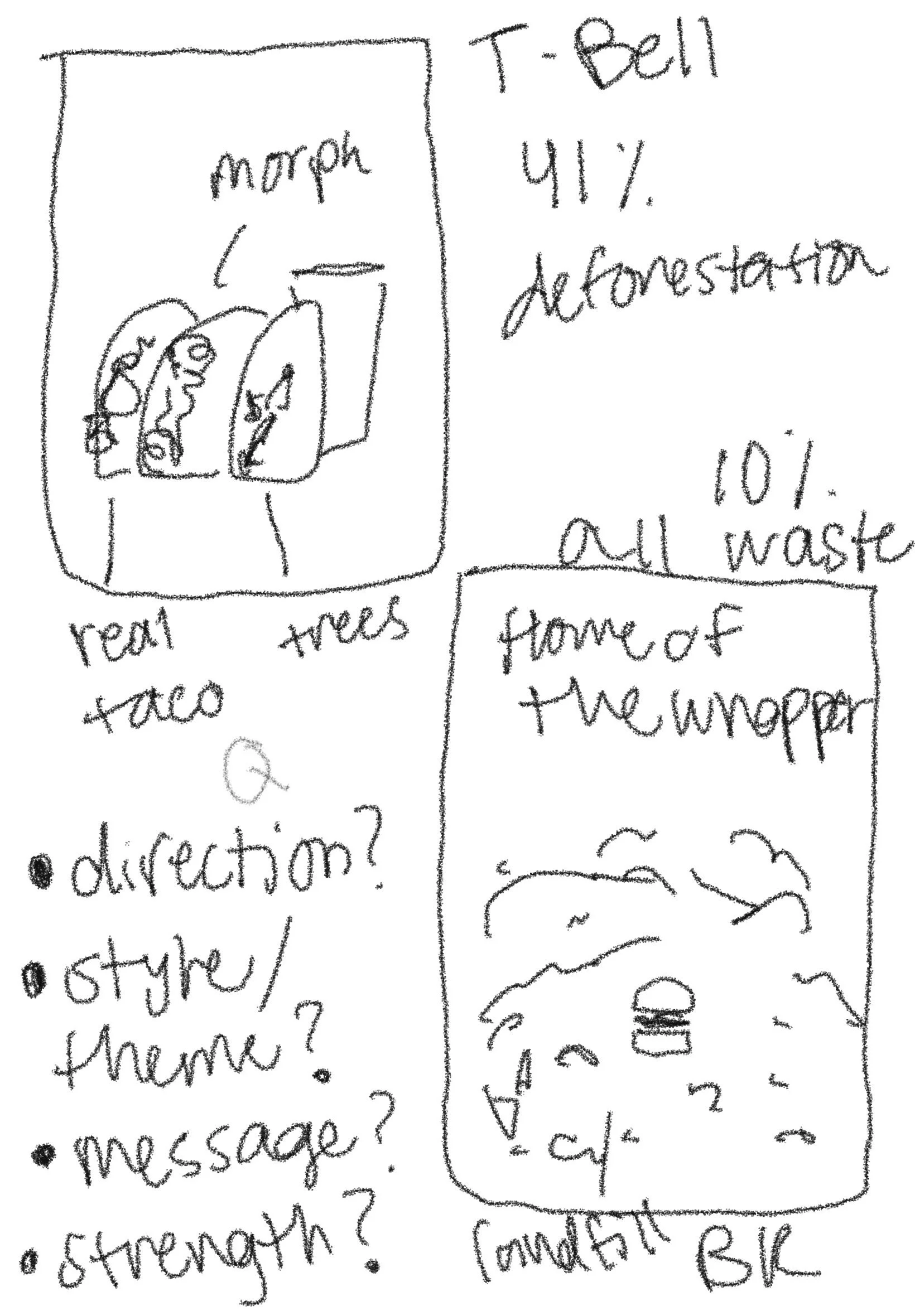
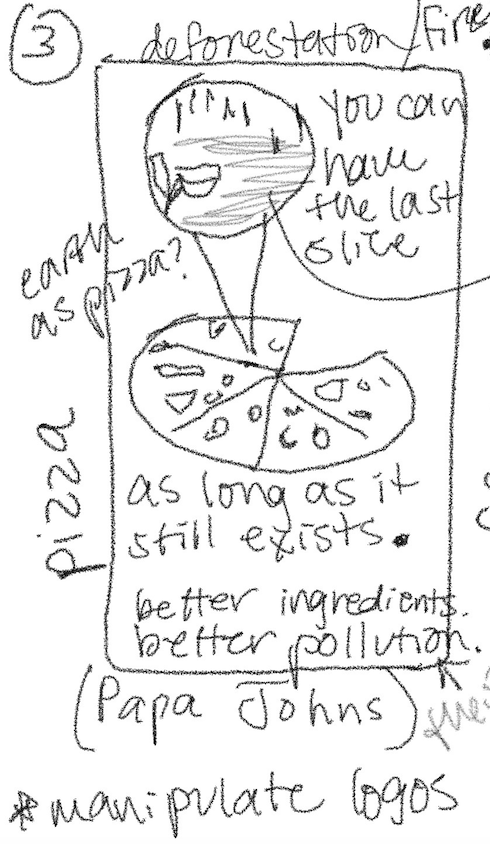
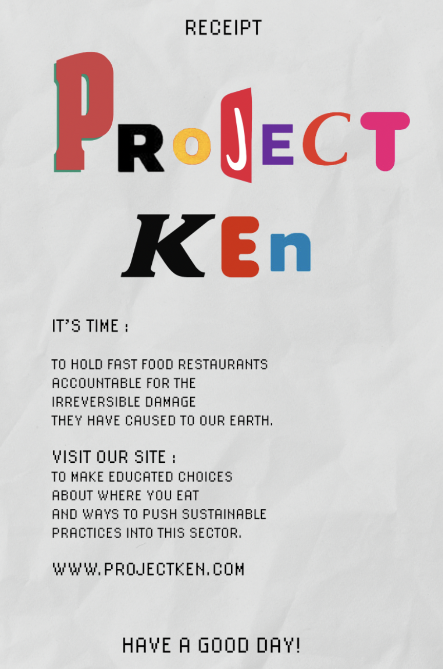
With the Project Ken brand, I originally wanted to make a logo (playing with the idea of an hourglass) and a mocked up webpage but I opted for the receipt poster that would accompany the rest of the posters. Here, you can see many ideas that zoomed through my head. Some concepts were strong but not strong enough to make the final line up. I absolutely loved experimenting with play on words and creative problem solving with all of the ideas I tried. Below I will include some versions of the posters that didn’t make the cut.
